We all knew it was coming. Lawrence Ferlinghetti, the man who made City Lights Bookstore and Allen Ginsberg famous, has died at the age of 101, just a month short of his 102nd birthday.
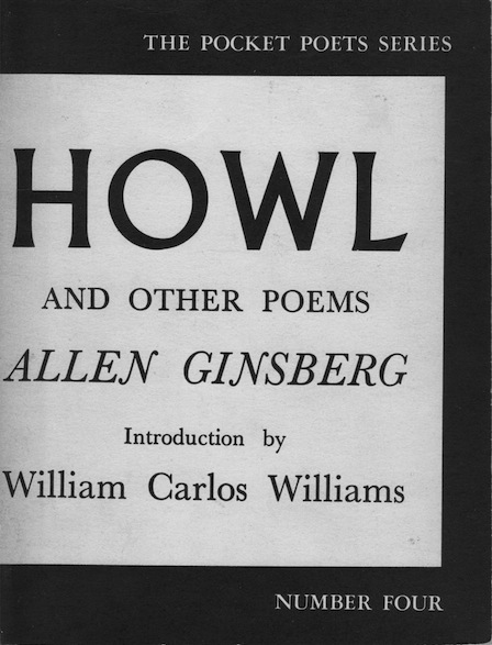
If you’re reading this, you probably already know about Ferlinghetti’s connection to the Beats, his role in defending free speech, and expanding access to art and ideas for as many people as possible. You probably also remember what the cover of Ginsberg’s Howl looks like, that bold, stark design that is featured on the majority of the titles in the City Lights Pocket Poets Series.
What you may not know is how that look came about, and how the vagaries of life could have taken it in just about any other direction.
It happened like this:
In 1944, the third year of World War II, an eighteen-year-old kid named Bill Shank decided that he could not support the war and so registered as a conscientious objector. Coming from New Jersey, he was sent to a work camp in rural upstate New York, where he met some likeminded CO’s and heard about another camp in Oregon where they were accepting people interested in contributing to a fine arts collective — writers, artists, actors, and musicians. Bill Shank didn’t know if he was an artist, but he was interested in art. And he also knew a real poet from his hometown — Kenneth Patchen, who had already made a name for himself in the avant garde circles of New York. Patchen was also vehemently against war, and although he was not drafted because of a physical disability, that didn’t stop him from speaking out.
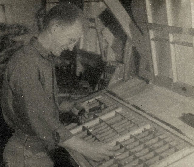
Shank asked Patchen to write him a letter of recommendation for the fine arts group in Oregon, and that got him accepted into the camp just south of Waldport on the Oregon Coast, where he met Bill Everson, Adrian Wilson, Clayton James, and others in what was called the Fine Arts Group at Waldport. They had acquired an old printing press, and ran a publishing effort they called the Untide Press, producing booklets of poetry in hand-set type and high-quality paper — even back then considered “fine press editions.”
Not long after Shank arrived, he suggested that the Untide Press might reach out to Patchen and see if he had anything for them to publish. It turned out that Patchen was interested, and he sent a collection of his antiwar poems, saying that they could be published under one condition: If any money was actually made, all profits must be invested back into the publishing operation to support other antiwar books.
They got to work, and Patchen communicated through letters from afar on questions concerning the book, titled An Astonished Eye Looks Out of the Air. The book design was a collaboration with Kemper Nomland, who had designed a few of the earlier books done by the Untide Press. Nomland was an architect, and his designs often used solid blocks of color as a main feature. Maybe it was his idea, or maybe it was Patchen’s, but the final product was an incredibly simple design. The heavy card-stock cover was black, folded at the spine with two staples attaching it to the text block, the same as can be found on many thin pamphlets — what the trade calls “saddle stitched.”
But this one was a little different. After the book was stapled, they added a block of white paper that was uniformly a couple inches smaller than the booklet’s cover. They folded it the same as the cover, then glued it onto the black card stock, covering the staples on the spine and creating a contrasting smaller block on both the front and back of the book. The title and author had been already printed on the white sheet, so when it was attached to the book, it served to hide the staples and showcase the title against a bold contrasting background. Like most brilliant inventions, it was simple and utilitarian.

Brilliant as it was, we probably would never have heard of it if a few key people had not converged on the same city after the war. Bill Everson and a number of other CO’s headed south to San Francisco, where they met Kenneth Rexroth and contributed to the early ferment of what would come to be known as the San Francisco Poetry Renaissance of the 1950s. Ferlinghetti arrived in 1951, and two years later opened the City Lights Pocket Bookshop. Patchen came west about that time, and at some point gave Ferlinghetti a copy of his book published by the Untide Press.
Ferlinghetti liked the design so much that he adopted it in 1955 for his new line of poetry booklets, the Pocket Poets Series. Each title featured the same block-on-block design, and the earlier ones used the same style of wraparound sheet glued on to cover the staples.
The first title, Ferlinghetti’s own Pictures of the Gone World, was yellow on black. Number Two, Kenneth Rexroth’s translations of Thirty Spanish Poems of Love and Exile, was gold on red. Number Three, Patchen’s Poems of Humor & Protest, was white on blue.
Then came Number Four. After the infamous Six Gallery reading that uncorked Alan Ginsberg’s Howl, Ferlinghetti published it in the Pocket Poets, with the stark white-on-black design now instantly recognized throughout the world.

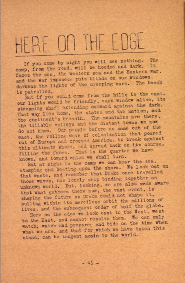
While researching Here on the Edge, I was able to reach Mr. Ferlinghetti and ask him how he came to choose the design created by conscientious objectors at a backwoods camp in Oregon. Like so many things related to the Beats and San Francisco and much of art in general, in Ferlinghetti’s words, “It just happened.”
I am certainly not saying that Howl became famous solely because of the cover. But the kind of energy that produced that design contributed to the environment that made Howl and other such works possible. And what if Bill Shank had never made it out to Oregon? What if Kemper Nomland had never worked with Patchen? What if that stark design had never been created? What images or words would be burned in our literary memories today?
This of course is pure speculation; some might even say unfounded speculation. Fair enough. But the sequence of events does consist of seemingly coincidental parts that somehow assemble into the whole. And isn’t history in some sense an attempt to bring order to the coincidences that make up our lives? When we ask “Could things have been any other way?” the answer is that we will never know. Perhaps that’s the enduring mystery.


